What is the 'Discovery Panel'?

There's a lot more detail below, but by way of introduction the 'Discovery Panel' is a tool for looking deeper into the content of an article than simply reading the words! It helps you understand the context and focus of an article, consider what the main themes and concepts are and importantly visually link to and discover more related content. As well as all that we also think it’s just pretty cool! Want to learn more? Read on…..
Check out the video!
Accessing the 'Discovery Panel'
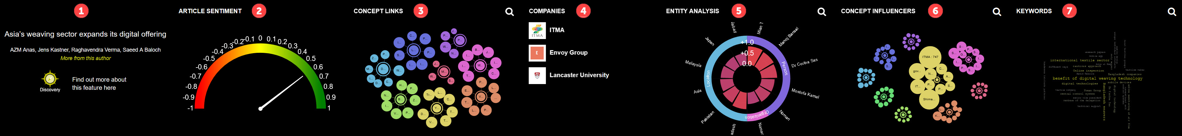
It's very easy! Just click the 'Discovery' button when viewing any article on the site.
|
Content aggregation and natural language analysis – The cornerstone of what we are doing We have developed a fully-fledged aggregation system that scans across the Internet for relevant content in our industry sector. Once we find a piece of content, let’s say from abc.com a few things happen.
For a single content piece this is interesting and informative, but what happens when you take a step back and aggregate this information over large quantities of data? You discover trends, information and related content that you just wouldn’t have seen before. We can generate an overview of the industry as a whole of sub-sectors within it. On an average day we analyse over 500 pieces of content, extract metadata and aggregate information from all of them. That’s over 180,000 content pieces a year! |
Parts of the 'Discovery Panel'
There are six main sections to the 'Discovery Panel'. We'll look at the charts in detail below, but for now here's a summary.
- The header/intro section. This is straight forward and contains a link to this help page and also the article and author(s) name. Click the author(s) name to search for other content by them.
- The article sentiment score. There's a panel to the right (or a little further down this page) explaining about sentiment so have a look at that. Suffice to say the article is analysed using natural language processing and a score between -1 (very negative) to +1 (very positive) is calculated indicating the written sentiment of the content.
- The concept links chart. This is a node diagram that does some neat things. It extracts concepts that are referenced or inferred in the content and places the most relevant in the centre of several nodes. Linking from these nodes it then branches to the most relevant recent content that also discussed that concept and you can quickly link to those articles. It does more, so read the detailed section below. The magnifying glass icon to opens a zoomed version of the chart.
- Company factsheets. Most companies mentioned within the content are automatically extracted from the content and shown with logos inside the Discovery panel. Clicking the logos links you to a detailed factsheet with stacks on information about the relevant company. Find more information on the company factsheets here.
- The entity analysis chart. Here we use natural language processing to extract ‘entities’ the companies, locations, people, regions, organisations and technologies that are mentioned or implied within the content. It shows the relevance of the extracted entities and allows you to link to related content. See below for more details. You can click the magnifying glass icon to open a zoomed version of the chart.
- The concept influencers chart. This oen is similar to the concept links chart. However, instead of linking concepts discussed in the article to other related content the outer nodes are the key influencers (companies, organisations and people) for that particular concept.
- The keyword cloud. Something of a data visualisation classic again uses natural language processing to pull words and phrases from the content that are key to its composition and context. Presented in an overlapping word cloud the size of the word represents its relevance to the content. More on this below. The magnifying glass icon to opens a zoomed version of the chart.
|
Sentiment - What's that? The sentiment polarity is a verbal representation of the sentiment of a document, named entity or phrase in the context it is used. It can be "negative", "neutral", or "positive". The sentiment score is a more precise numerical representation of the sentiment polarity. It ranges from -1 (negative) to +1 positive and can be anything in-between. We won’t go into detail as to how it’s calculated, suffice to say text is analysed and an overall score for the document and/or scores for individual elements (entities) within the text are calculated. It’s a useful tool for reviewing both individual documents (articles) and tracking averages over time and other parameters. For example; say you wanted to know how opinion towards your brand or product has changed over time or after a specific launch. You can use sentiment scoring to do this. We already use sentiment scoring in our analysis and will be doing so more and more. |
The charts in more detail
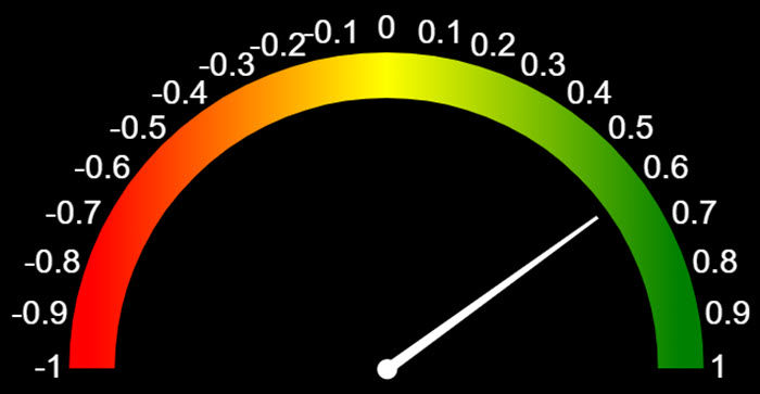
The sentiment chart
This is the simplest of the charts. It’s a bullet chart centred on 0 and extending left to -1 and right to +1. The panel above discusses sentiment scoring and what this means to we won’t delve deeply here. Scores of -1.0 to about -0.1 are usually considered as negative sentiment, -0.1 through to +0.25 is neutral and +0.25 to +1.0 is positive. You’ll notice that the neutral label extends further above 0 than the negative does below. This is due to a natural tendency to sway towards the positive. In the context of the ‘Discovery Panel’ the sentiment chart gives you a quick-fire way of seeing the overall emotional bias of the content.
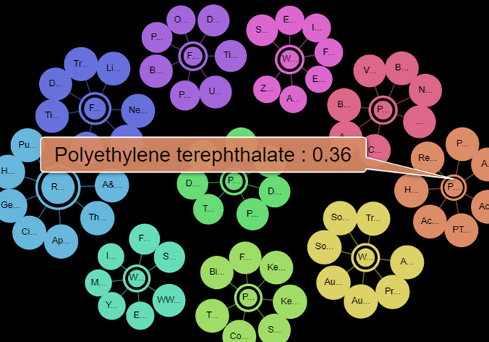
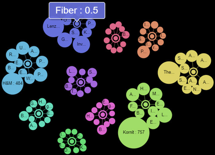
Concept links
We think this is pretty cool. This chart extracts the top concepts discussed in an article and plots them as nodes (the bits in the middle) of a node diagram. The larger the central node the more relevant to the article that concept is and if you hover over the node you can see a relevance score (between 1 and 0). If you click the central node you will open the dbpedia page describing that concept. E.g. http://dbpedia.org/page/Polyethylene_terephthalate.
Around the central nodes are child nodes. These are other recent articles that also relate to that concept. You can hover over these to see the title of that article and the relevance score of the concept to that other article. Also, the bigger the node ‘bubble’ then the larger the relevance. It's a great way of finding other related content for a concept/topic you are interested in. Give it a try!
Concept influencers
This is the newest kid on the block of our charts. It takes the same (or similar) concepts plotted on the concept links chart, but instead of plotting related articles around the concept it plot 'key influencers' on that concept. Those 'influencers' might be companies/organisations or people. The larger the satellite node around the concept the more influential it is to it. Clicking on the central node takes you to an explanation on DBpedia as with the concept links chart and clicking on the satellite nodes will take you to a relevance ordered search related to the influencer. This is a great way of understanding who the key players are for a given topic and finding out more about them.
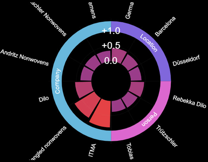
Entity Analysis
Whenever we read a piece of text, particularly the type of articles found on wtin.com there are ‘named entities’ referenced in the text (http://dbpedia.org/page/Named-entity_recognition). We extract the companies, locations, people, regions, organizations and technologies discussed in content and this radar chart plots them in a visual format. The outer segments of the radar determine the specific entity type and the inner segments are the actual named entities themselves. You can click the outer segments to filter to just that entity type and the larger the inner segment 'slice' the more relevant it is the content being analysed.
Clicking the inner segment/slice opens a search for other related content.
As with the concept links chart this is a great way of finding related content. For example, you can see who the important people to the article are and then go an find other content relevant to that person.
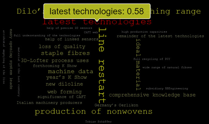
Keyword Cloud
A modern classic! The keyword cloud uses natural language understanding (http://dbpedia.org/page/natural_language_understanding) to extract the key words and phrases from content. These keywords and phrases are then plotted into a word cloud. The larger the word/phrase is shown the more relevant it is in the content and the more emphasis is placed on it grammatically. If you hover over a word/phrase you will see the relevance score (between 0 – 1). If you click the word/phrase then it will open a wtin.com search to find related content.
This is a simple and effective way of understanding the key topics and elements within an article and helping you find out more information on them.
|
The (kind of) small print bit So, what’s the ‘caveat’. We thought we should add this little comment at the end! Artificial Intelligence and Machine Learning are ever evolving as are the tools on wtin.com. They are not perfect, but are getting better over time! They already provide a unique and novel way for the user to discover new information, data and trends. You might see some examples where similar company names that are obviously the same are represented different, e.g., ‘ABCD’ and ‘ABCD Inc.’ or you might see an entity that is a person listed as an organisation. These instances are rare, but we do know they are there and are working hard to improve the features all the time! |
Want to know more?